Thomas’ Bread

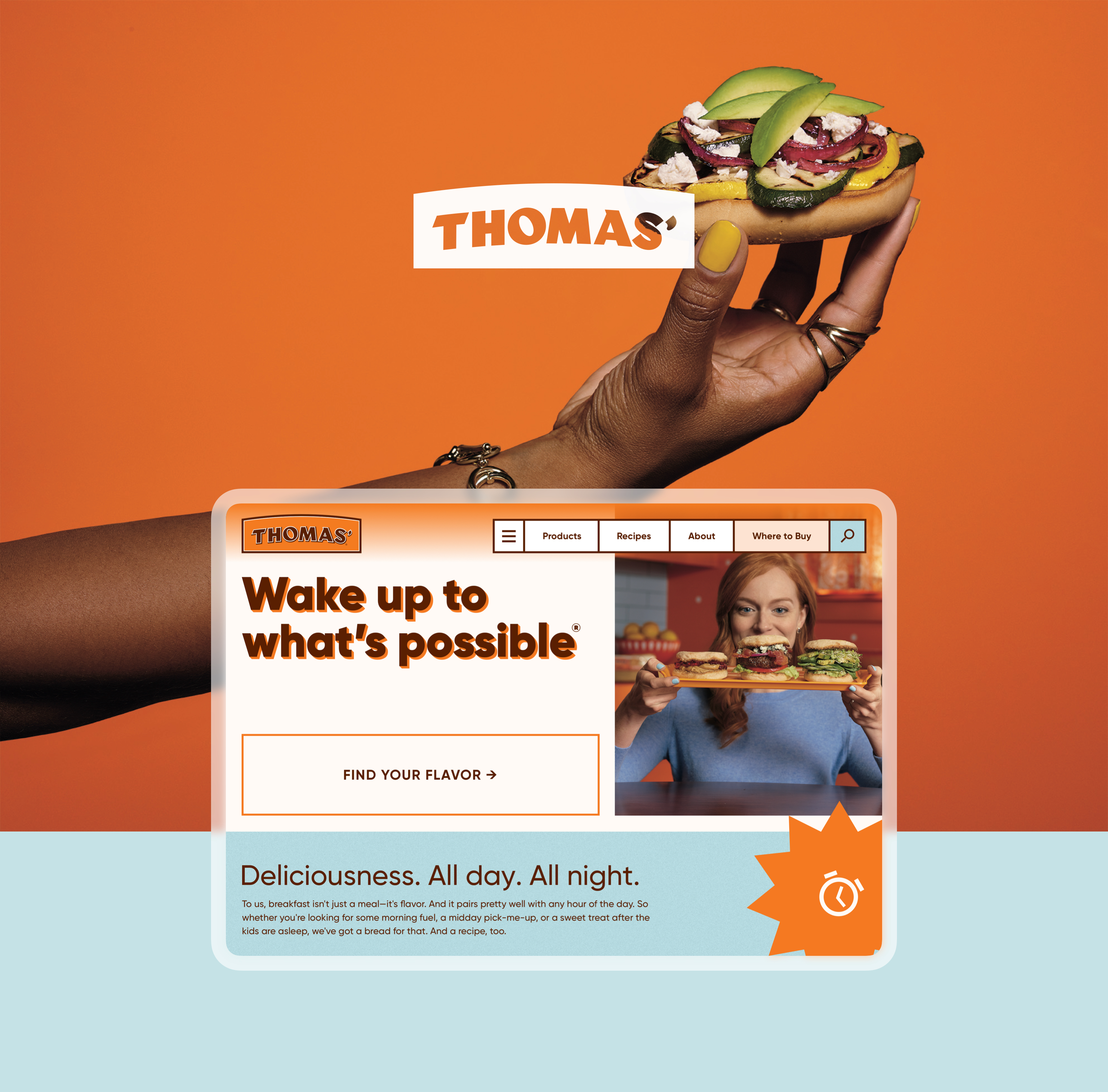
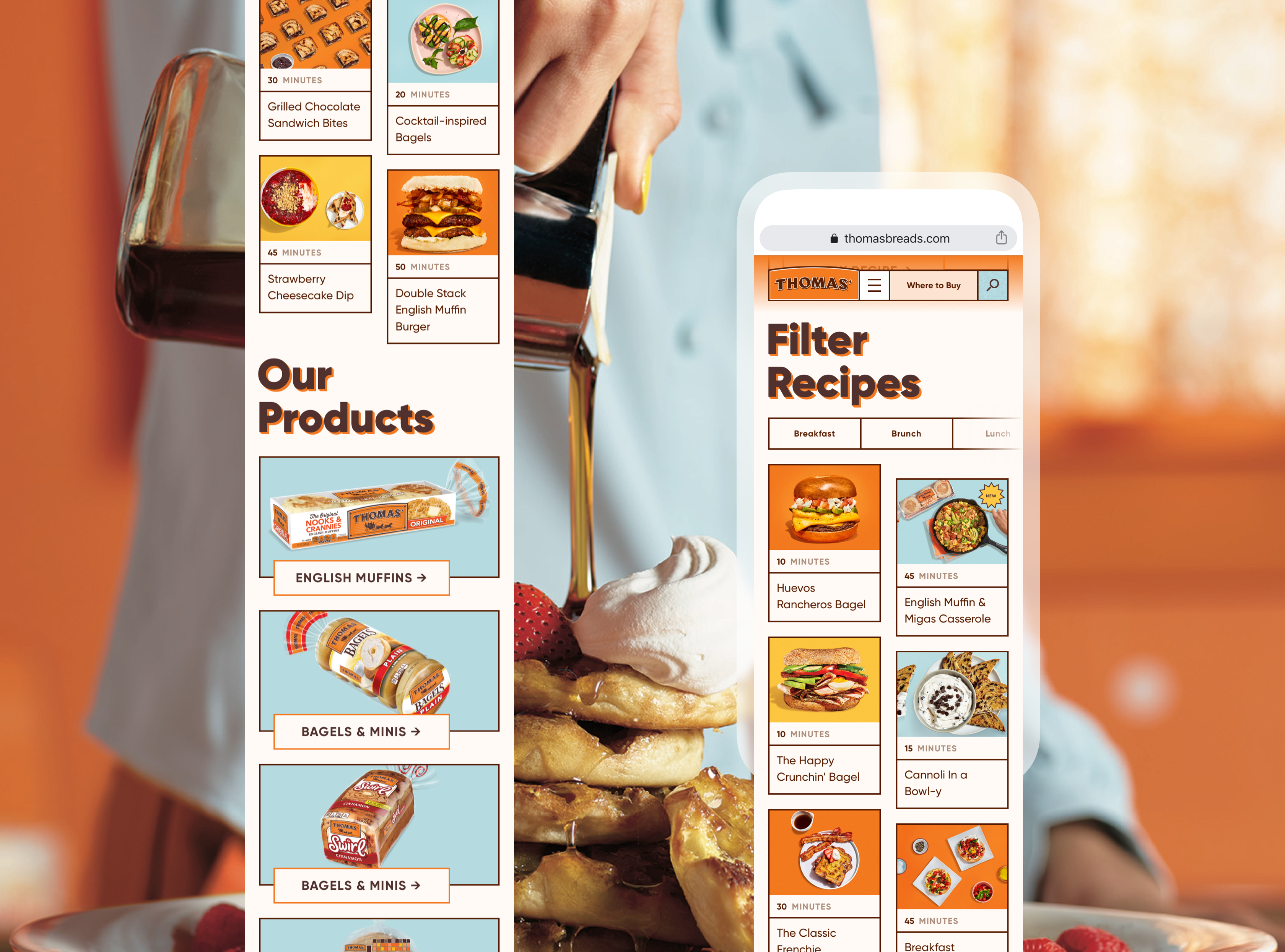
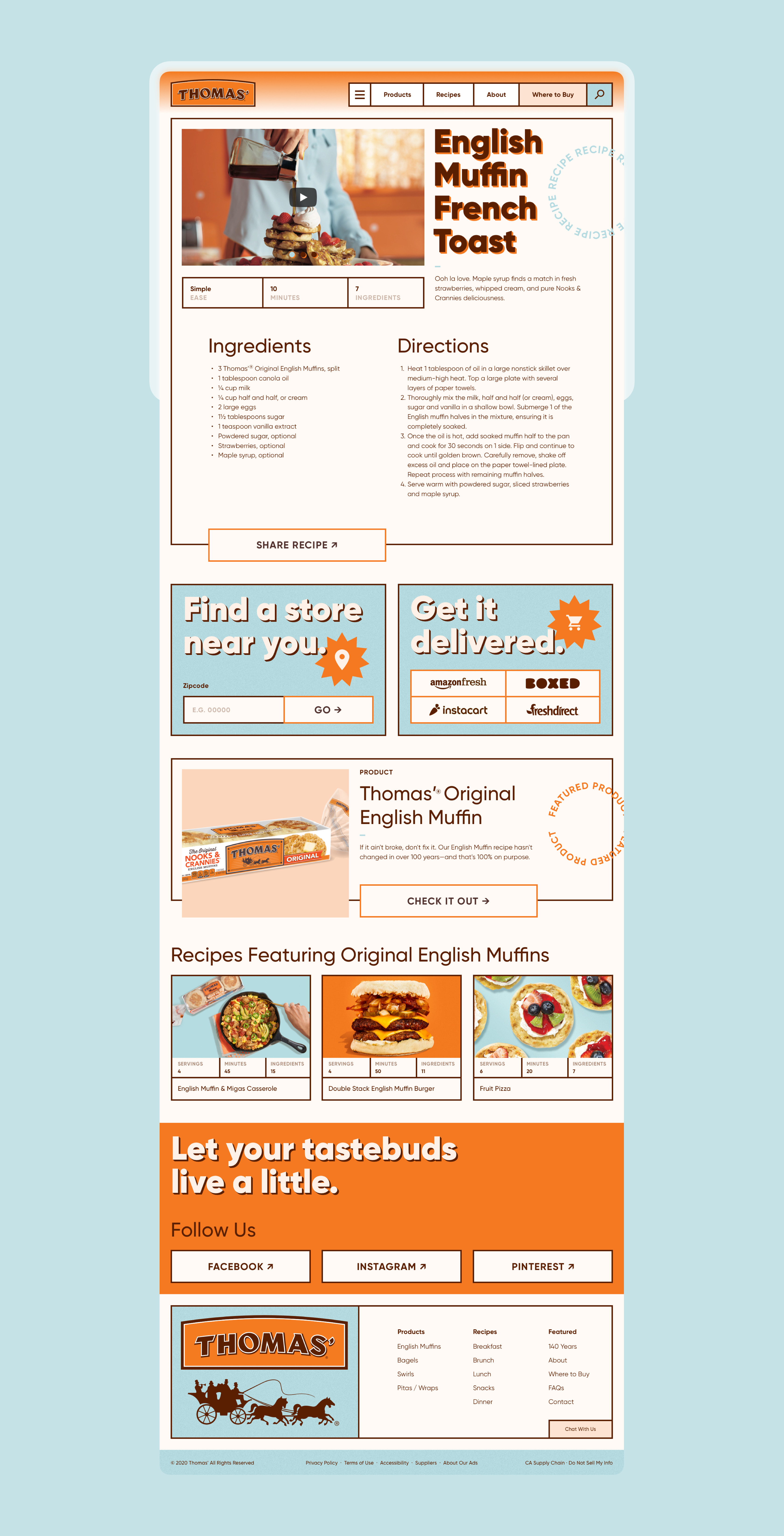
As a part of their “Wake up to what’s possible” campaign Thomas needed a completely new website that would house all their products, as well as hundreds of unique recipes. Featured below is my proposed design direction for the site. I chose to push the look into a warm and retro space, leaning into their existing orange and blue color palette. Expanding on the visual language from the campaign I used large typography with a 3D effect. I also utilized outlines for each component, informed by the logo, that reveal the grid and give the site structure. A subtle texture on the blue color is nod to the texture of their signature English muffins.
SCOPE
Web Design
Art Direction
CREDITS
Sydney Lemons
Web Design
Art Direction
CREDITS
Sydney Lemons


